In Praise of Daylight
I'm beginning to think the control of light - both daylight and artificial - could be the single most important factor in museums and exhibitions. Having been so deeply affected by the beautiful artificial lighting at the Musee Guimet in Paris, I was bowled over by an entirely opposite experience in Renzo Piano’s reworking of the venerable Harvard Art Museums near Boston.
Front elevation of the former 1927 Fogg Museum on Quincy Street, recently refurbished and extended to become the Harvard Art Museums
The scheme has brought together three existing museum collections under one roof of the refurbished and extended 1927 Fogg Museum. The architectural context includes not only the Ivy League elegance of old Harvard but Le Corbusier's Carpenter Center as immediate neighbour and a James Stirling building as the former home of the Arthur M. Sackler Museum whose collections are now incorporated in the extended Fogg Museum.
Piano has retained the Georgian Revival brick exterior and the Italian Renaissance-style interior courtyard but has quite literally lifted the lid on the whole structure and extended to the rear to create truly uplifting and largely daylit spaces. While appearing very natural and incidental, in fact the daylighting is of course highly controlled.
The central courtyard around which all the galleries are arranged is now flooded with light from above
Seeing artefacts in daylit spaces has the remarkable effect of making these pieces of sculpture seem somehow more accessible, less numinous than the beautiful depth of shadows of the Guimet. With the additional views and reflections of buildings outside the daylit art pieces look more like expressions of daily life.
Of course there’s nothing new about glass and steel hi-tech extensions to existing historic museums but exactly how that glass and steel are interposed with the old stones is crucial to the museum’s success as a venue for art and design. Piano expresses these new relationships with a glass seam which sews the new addition to the 1927 building, a seam which is both legible and open throughout the visit.
The rear of the original Fogg Museum on Prescott Street has been reinvented with a robust but malleable addition. View from the rear of Le Corbusier's Carpenter Center shows Piano's dexterity with contemporary materials and his playful response to a complex architectural context
While the impact of such permeable internal spaces is uplifting, the impact externally is intriguing as the new addition appears to dissolve in the reflections of the neighbouring buildings, as though it were trying to be subservient to the architectural context. At the same time, Piano’s additions are resolutely contemporary and impose a strong presence on the street. Piano himself describes it as “neither arrogant nor timid.”
Artefacts seen within a daylit gallery offering views to neighbouring Harvard Buildings become more of an expression of everyday life
Le Corbusier's Carpenters Center glimpsed through the shaded slot between new and old building
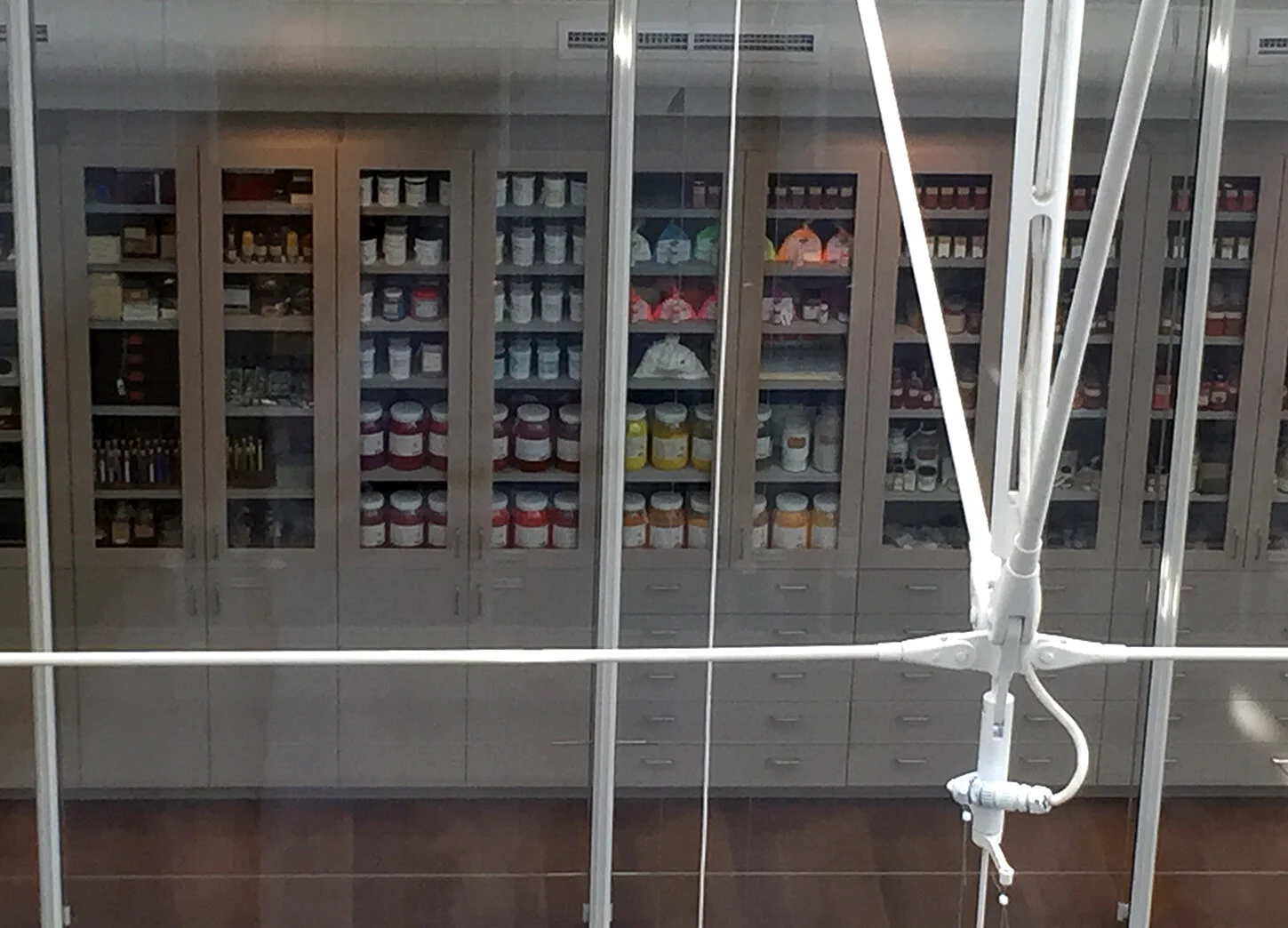
The huge gesture of natural daylighting permeates the museum, draws visitors through spaces and up towards the upper floors. This permeability between street, inner courtyard and display gallery is matched by an openness and permeability in the museum's working spaces. Below, a cabinet of pigments used by conservators is on display from the Lightbox Gallery and elsewhere visitors can see conservation work going on through generous windows and programmed events.
Paint pigment store for use by conservators is on view and forms part of the aesthetic of the museum
The sculpture conservation workshop is visible to the public and surprisingly flooded with light
I’ve discussed in previous blogs how often museum design is at odds with the design of the content on display. But my feeling at the Harvard Art Museums is that Piano and local architects Payette have succeeded in creating a truly holistic design where building and content speak in interesting and varied dialogues, all moving toward the same end: the appreciation of form, whether urban, architectural, sculptural or painterly.
